"use client";
import * as React from "react";
import { Badge } from "@/registry/default/ui/badge/radix";
import { Button } from "@/registry/default/ui/button/radix";
import {
Card,
CardContent,
CardHeader,
CardTitle,
CardToolbar,
} from "@/registry/default/ui/card/radix";
import {
DropdownMenu,
DropdownMenuContent,
DropdownMenuItem,
DropdownMenuSeparator,
DropdownMenuTrigger,
} from "@/registry/default/ui/dropdown-menu";
import {
ArrowUpRight,
Minus as MinusIcon,
MoreVertical,
Pin,
Settings,
Share2,
ShieldCheck,
TriangleAlert,
} from "lucide-react";
const bars = [6, 6, 5, 5, 4, 4, 3, 0];
const maxBars = Math.max(...bars);
const barInsights = [
{
date: "24 Feb 2025",
growth: 8.2,
direction: "up",
note: "Feature launch week. Strong adoption spike.",
},
{
date: "08 Mar 2025",
growth: 7.5,
direction: "up",
note: "Onboarding improvements led to a 7.5% boost in adoption.",
},
{
date: "15 Mar 2025",
growth: 2.1,
direction: "up",
note: "Steady growth as more teams enabled the feature.",
},
{
date: "22 Apr 2025",
growth: 0.0,
direction: "neutral",
note: "Temporary plateau after a minor bug was reported.",
},
{
date: "29 May 2025",
growth: 0.0,
direction: "neutral",
note: "Seasonal dip, many users on vacation.",
},
{
date: "06 Jun 2025",
growth: 0.0,
direction: "neutral",
note: "No significant change, awaiting next release.",
},
{
date: "13 Jul 2025",
growth: 1.4,
direction: "up",
note: "Beta feature feedback positive, slight increase.",
},
{
date: "20 Jul 2025",
growth: 0.0,
direction: "neutral",
note: "Stable week, engagement holding steady.",
},
];
function GrowthBadge({
direction,
growth,
}: {
direction: string;
growth: number;
}) {
if (direction === "up")
return (
<Badge className="bg-indigo-100 text-indigo-700 px-2 py-0.5 rounded text-xs font-medium flex items-center gap-1">
<ArrowUpRight className="w-3 h-3" />+{growth}%
</Badge>
);
return (
<Badge className="bg-muted text-muted-foreground px-2 py-0.5 rounded text-xs font-medium flex items-center gap-1">
<MinusIcon className="w-3 h-3" />
{growth}%
</Badge>
);
}
function getBarColor(direction: string, j: number, height: number) {
if (height === 0) return "bg-muted";
// Even color progression from intense to neutral
const barColors = [
"bg-indigo-600",
"bg-indigo-500",
"bg-indigo-400",
"bg-indigo-300",
"bg-indigo-200",
"bg-indigo-100",
];
return j < height ? barColors[j] : "bg-muted";
}
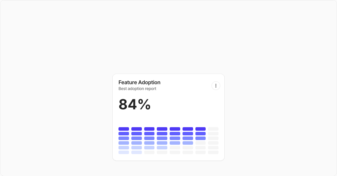
export default function StatisticCard14() {
const barRefs = React.useRef<(HTMLDivElement | null)[]>([]);
return (
<div className="min-h-screen flex items-center justify-center p-6 lg:p-8">
<Card className="w-full max-w-sm">
<CardHeader className="border-0 min-h-auto pt-5 pb-0">
<CardTitle className="flex flex-col items-start gap-0.5">
<div className="text-lg font-semibold text-foreground leading-none">
Feature Adoption
</div>
<div className="text-sm font-medium text-muted-foreground">
Best adoption report
</div>
</CardTitle>
<CardToolbar>
<DropdownMenu>
<DropdownMenuTrigger asChild>
<Button variant="outline" size="icon-sm" className="-me-1.5">
<MoreVertical />
</Button>
</DropdownMenuTrigger>
<DropdownMenuContent align="end" side="bottom">
<DropdownMenuItem>
<Settings />
View Details
</DropdownMenuItem>
<DropdownMenuItem>
<TriangleAlert /> Export Report
</DropdownMenuItem>
<DropdownMenuItem>
<Pin /> Configure Alerts
</DropdownMenuItem>
<DropdownMenuSeparator />
<DropdownMenuItem>
<Share2 /> Run Manual Check
</DropdownMenuItem>
<DropdownMenuItem>
<ShieldCheck /> View History
</DropdownMenuItem>
</DropdownMenuContent>
</DropdownMenu>
</CardToolbar>
</CardHeader>
<CardContent className="space-y-5">
{/* Value */}
<div className="text-5xl font-bold text-foreground">84%</div>
{/* Bars */}
<div className="flex items-end gap-2 w-full h-32 mt-2 relative">
{bars.map((height, i) => (
<div
key={i}
ref={(el) => {
barRefs.current[i] = el;
}}
className="flex flex-col justify-end flex-1 min-w-0 cursor-pointer transition-all"
>
{[...Array(maxBars)].map((_, j) => (
<div
key={j}
className={`h-3 my-0.5 rounded ${getBarColor(barInsights[i].direction, j, height)}`}
/>
))}
</div>
))}
</div>
</CardContent>
</Card>
</div>
);
}