statistic-card-8
Single block view - Copy and use this block in your project: statistic-card-8
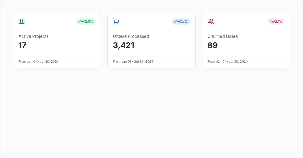
Statistic Card 8 – Bordered Icon Metric Cards
A grid of three distinct metric cards featuring circular bordered icons. Each card displays a key metric with trend indicator and date range footer.
Key Features
- Three Metrics – Total Projects, New Orders, Churned Users.
- Bordered Icons – Circular containers with colored borders.
- Trend Badges – Top-right percentage indicators.
- Date Range Footer – Context for the metric timeframe.
- Responsive Grid – 1-3 columns based on screen size.
Visual Design
- Icon Colors – Green (Projects), Blue (Orders), Pink (Churned).
- Border Styling – 4px colored borders on icons.
- Footer Separator – Top border for date range section.
Use Cases
- Project Management – Track project metrics.
- E-commerce Dashboards – Order statistics.
- Customer Analytics – User churn tracking.
- Operations Overview – Multiple KPI displays.
Technical Stack
- React – Component with icon configurations.
- Tailwind CSS – Colored border styling.
- Radix UI – Card, Badge components.
- Lucide Icons – Briefcase, ShoppingCart, Users.
Didn't find what you were looking for?
Suggest block