area-chart-1
Single block view - Copy and use this block in your project: area-chart-1
Loading...
charts/area-charts/area-chart-1.tsx
"use client";

import React from "react";
import { Card, CardContent } from "@/registry/default/ui/card/radix";
import { CircleDollarSign, TrendingUp, UserPlus } from "lucide-react";
import { Area, AreaChart, ResponsiveContainer, Tooltip } from "recharts";

// Business Case 1: SaaS Revenue Tracking
const revenueData = [
  { value: 1000 },
  { value: 4500 },
  { value: 2000 },
  { value: 5200 },
  { value: 1500 },
  { value: 6100 },
  { value: 3000 },
  { value: 6800 },
  { value: 2000 },
  { value: 1000 },
  { value: 4000 },
  { value: 2000 },
  { value: 3000 },
  { value: 2000 },
  { value: 6238 },
];

// Business Case 2: New Customer Acquisition
const customersData = [
  { value: 2000 },
  { value: 4500 },
  { value: 2000 },
  { value: 5200 },
  { value: 1500 },
  { value: 5100 },
  { value: 2500 },
  { value: 6800 },
  { value: 1800 },
  { value: 1000 },
  { value: 3000 },
  { value: 2000 },
  { value: 2700 },
  { value: 2000 },
  { value: 4238 },
];

// Business Case 3: Monthly Active Users
const activeUsersData = [
  { value: 2000 },
  { value: 3500 },
  { value: 2000 },
  { value: 5200 },
  { value: 1200 },
  { value: 4100 },
  { value: 3500 },
  { value: 5800 },
  { value: 2000 },
  { value: 800 },
  { value: 3000 },
  { value: 1000 },
  { value: 4000 },
  { value: 2000 },
  { value: 4238 },
];

// Business cards configuration
// Use custom or Tailwind standard colors: https://tailwindcss.com/docs/colors
const businessCards = [
  {
    title: "Revenue",
    period: "Last 28 days",
    value: "6.238$",
    timestamp: "",
    data: revenueData,
    color: "var(--color-emerald-500)",
    icon: CircleDollarSign,
    gradientId: "revenueGradient",
  },
  {
    title: "New Customers",
    period: "Last 28 days",
    value: "6.202",
    timestamp: "3h ago",
    data: customersData,
    color: "var(--color-blue-500)",
    icon: UserPlus,
    gradientId: "customersGradient",
  },
  {
    title: "Active Users",
    period: "Last 28 days",
    value: "18.945",
    timestamp: "1h ago",
    data: activeUsersData,
    color: "var(--color-violet-500)",
    icon: TrendingUp,
    gradientId: "usersGradient",
  },
];

export default function AreaChart1() {
  return (
    <div className="min-h-screen flex items-center justify-center p-6 lg:p-8">
      <div className="@container w-full max-w-6xl">
        {/* Grid of 3 cards */}
        <div className="grid grid-cols-1 @3xl:grid-cols-3 gap-6">
          {businessCards.map((card, i) => {
            const Icon = card.icon;
            return (
              <Card key={i}>
                <CardContent className="space-y-5">
                  {/* Header with icon and title */}
                  <div className="flex items-center gap-2">
                    <Icon className="size-5" style={{ color: card.color }} />
                    <span className="text-base font-semibold">
                      {card.title}
                    </span>
                  </div>

                  <div className="flex items-end gap-2.5 justify-between">
                    {/* Details */}
                    <div className="flex flex-col gap-1">
                      {/* Period */}
                      <div className="text-sm text-muted-foreground whitespace-nowrap">
                        {card.period}
                      </div>

                      {/* Value */}
                      <div className="text-3xl font-bold text-foreground tracking-tight">
                        {card.value}
                      </div>
                    </div>

                    {/* Chart */}
                    <div className="max-w-40 h-16 w-full relative">
                      <ResponsiveContainer width="100%" height="100%">
                        <AreaChart
                          data={card.data}
                          margin={{
                            top: 5,
                            right: 5,
                            left: 5,
                            bottom: 5,
                          }}
                        >
                          <defs>
                            <linearGradient
                              id={card.gradientId}
                              x1="0"
                              y1="0"
                              x2="0"
                              y2="1"
                            >
                              <stop
                                offset="0%"
                                stopColor={card.color}
                                stopOpacity={0.3}
                              />
                              <stop
                                offset="100%"
                                stopColor={card.color}
                                stopOpacity={0.05}
                              />
                            </linearGradient>
                            <filter
                              id={`dotShadow${i}`}
                              x="-50%"
                              y="-50%"
                              width="200%"
                              height="200%"
                            >
                              <feDropShadow
                                dx="2"
                                dy="2"
                                stdDeviation="3"
                                floodColor="rgba(0,0,0,0.5)"
                              />
                            </filter>
                          </defs>

                          <Tooltip
                            cursor={{
                              stroke: card.color,
                              strokeWidth: 1,
                              strokeDasharray: "2 2",
                            }}
                            content={({ active, payload }) => {
                              if (active && payload && payload.length) {
                                const value = payload[0].value as number;
                                const formatValue = (val: number) => {
                                  if (card.title === "Revenue") {
                                    return `${(val / 1000).toFixed(1)}k US$`;
                                  } else if (card.title === "New Customers") {
                                    return `${(val / 1000).toFixed(1)}k`;
                                  } else {
                                    return `${(val / 1000).toFixed(1)}k`;
                                  }
                                };

                                return (
                                  <div className="bg-background/95 backdrop-blur-sm border border-border shadow-lg rounded-lg p-2 pointer-events-none">
                                    <p className="text-sm font-semibold text-foreground">
                                      {formatValue(value)}
                                    </p>
                                  </div>
                                );
                              }
                              return null;
                            }}
                          />

                          {/* Area with gradient and enhanced shadow */}
                          <Area
                            type="monotone"
                            dataKey="value"
                            stroke={card.color}
                            fill={`url(#${card.gradientId})`}
                            strokeWidth={2}
                            dot={false}
                            activeDot={{
                              r: 6,
                              fill: card.color,
                              stroke: "white",
                              strokeWidth: 2,
                              filter: `url(#dotShadow${i})`,
                            }}
                          />
                        </AreaChart>
                      </ResponsiveContainer>
                    </div>
                  </div>
                </CardContent>
              </Card>
            );
          })}
        </div>
      </div>
    </div>
  );
}
Component Data
- Name:
- Area Chart 1 – Business Metrics Sparkline Cards
- Access:
- Pro
- Created:
- 2026-01-20
- Updated:
- 2026-01-01
- Released:
- N/A
- Type:
- Block
area-chartchartdashboardanalyticsmetricssparklinerevenuecustomersusersrechartstailwindreact
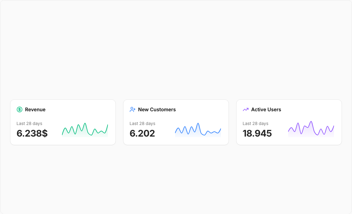
Area Chart 1 – Business Metrics Sparklines
A trio of compact metric cards featuring embedded area sparklines. Each card displays a key business metric with a mini chart showing recent trends – perfect for dashboard summary sections.
Key Features
- Three Business Metrics – Revenue, New Customers, Active Users.
- Embedded Sparklines – Compact area charts within each card.
- Icon Indicators – CircleDollarSign, UserPlus, TrendingUp icons.
- Gradient Fills – Color-matched gradients for visual appeal.
- Timestamp Display – Shows when data was last updated.
Visual Design
- Color Scheme – Emerald (Revenue), Blue (Customers), Violet (Users).
- Gradient Areas – Smooth transitions from line to transparent.
- Minimal Layout – Focus on key metrics and trends.
Use Cases
- Dashboard Headers – Quick KPI overview sections.
- Admin Panels – Business health at a glance.
- Executive Summaries – Key metrics for decision makers.
- SaaS Dashboards – Monitor growth indicators.
Technical Stack
- Recharts – AreaChart with ResponsiveContainer.
- Tailwind CSS – Emerald, blue, violet color palette.
- Radix UI – Card component structure.
- Lucide Icons – Business metric indicators.
Didn't find what you were looking for?
Suggest block