area-chart-4
Single block view - Copy and use this block in your project: area-chart-4
Loading...
charts/area-charts/area-chart-4.tsx
"use client";

import React, { Fragment, useState } from "react";
import {
  Card,
  CardContent,
  CardHeader,
  CardTitle,
  CardToolbar,
} from "@/registry/default/ui/card/radix";
import {
  ChartConfig,
  ChartContainer,
  ChartTooltip,
} from "@/registry/default/ui/chart";
import {
  ToggleGroup,
  ToggleGroupItem,
} from "@/registry/default/ui/toggle-group";
import { CheckCircle, Clock, TrendingUp } from "lucide-react";
import { Area, AreaChart, XAxis, YAxis } from "recharts";

// Subscription revenue data for different periods
const revenueData = {
  day: [
    { period: "00:00", revenue: 1200 },
    { period: "04:00", revenue: 800 },
    { period: "08:00", revenue: 2100 },
    { period: "12:00", revenue: 3200 },
    { period: "16:00", revenue: 2800 },
    { period: "20:00", revenue: 1900 },
  ],
  week: [
    { period: "Mon", revenue: 2400 },
    { period: "Tue", revenue: 2800 },
    { period: "Wed", revenue: 2200 },
    { period: "Thu", revenue: 3200 },
    { period: "Fri", revenue: 2900 },
    { period: "Sat", revenue: 1800 },
    { period: "Sun", revenue: 2600 },
  ],
  month: [
    { period: "Week 1", revenue: 16800 },
    { period: "Week 2", revenue: 18200 },
    { period: "Week 3", revenue: 15600 },
    { period: "Week 4", revenue: 19400 },
  ],
  year: [
    { period: "Q1", revenue: 198000 },
    { period: "Q2", revenue: 225000 },
    { period: "Q3", revenue: 189000 },
    { period: "Q4", revenue: 267000 },
  ],
};

const chartConfig = {
  revenue: {
    label: "Revenue",
    color: "var(--color-slate-600)",
  },
} satisfies ChartConfig;

// Custom Tooltip
interface TooltipProps {
  active?: boolean;
  payload?: Array<{
    dataKey: string;
    value: number;
    color: string;
  }>;
  label?: string;
}

const CustomTooltip = ({ active, payload }: TooltipProps) => {
  if (active && payload && payload.length) {
    return (
      <div className="rounded-lg bg-zinc-900 text-white p-3 shadow-lg">
        <div className="text-xs font-medium mb-1">Revenue:</div>
        <div className="text-sm font-semibold">
          ${payload[0].value.toLocaleString()}
        </div>
      </div>
    );
  }
  return null;
};

// Period configuration
const PERIODS = {
  day: { key: "day", label: "Day" },
  week: { key: "week", label: "Week" },
  month: { key: "month", label: "Month" },
  year: { key: "year", label: "Year" },
} as const;

type PeriodKey = keyof typeof PERIODS;

// Statistics data
const statisticsData = [
  {
    id: "finished",
    label: "Finished",
    value: "18",
    change: "+4 tasks",
    changeType: "positive",
    icon: CheckCircle,
  },
  {
    id: "tracked",
    label: "Tracked",
    value: "31h",
    change: "-6 hours",
    changeType: "negative",
    icon: Clock,
  },
  {
    id: "efficiency",
    label: "Efficiency",
    value: "93%",
    change: "+12%",
    changeType: "positive",
    icon: TrendingUp,
  },
] as const;

export default function AreaChart4() {
  const [selectedPeriod, setSelectedPeriod] = useState<PeriodKey>("day");

  // Get data for selected period
  const currentData = revenueData[selectedPeriod];

  return (
    <div className="min-h-screen flex items-center justify-center p-6 lg:p-8">
      <Card className="w-full lg:max-w-4xl rounded-2xl">
        <CardHeader className="min-h-auto py-6 border-0">
          <CardTitle className="text-xl font-semibold">
            Orders Overview
          </CardTitle>
          <CardToolbar>
            <ToggleGroup
              type="single"
              value={selectedPeriod}
              variant="outline"
              onValueChange={(value) =>
                value && setSelectedPeriod(value as PeriodKey)
              }
              className=""
            >
              {Object.values(PERIODS).map((period) => (
                <ToggleGroupItem
                  key={period.key}
                  value={period.key}
                  className="px-3.5 first:rounded-s-full! last:rounded-e-full!"
                >
                  {period.label}
                </ToggleGroupItem>
              ))}
            </ToggleGroup>
          </CardToolbar>
        </CardHeader>

        <CardContent className="px-0">
          {/* Statistics Blocks */}
          <div className="flex items-center flex-wrap px-6 gap-10 mb-10">
            {statisticsData.map((stat) => {
              const IconComponent = stat.icon;
              return (
                <Fragment key={stat.id}>
                  <div className="h-10 w-px bg-border hidden lg:block first:hidden" />
                  <div key={stat.id} className="flex items-center gap-3">
                    <div className="flex items-center">
                      <div className="flex items-center gap-3">
                        <div className="flex items-center justify-center w-10 h-10 rounded-full bg-muted/60 border border-muted-foreground/10">
                          <IconComponent className="w-4.5 text-muted-foreground" />
                        </div>
                        <div>
                          <div className="text-sm text-muted-foreground mb-0.5">
                            {stat.label}
                          </div>
                          <div className="flex items-center gap-2">
                            <span className="text-2xl font-bold">
                              {stat.value}
                            </span>
                            <span
                              className={`text-sm font-medium ${
                                stat.changeType === "positive"
                                  ? "text-emerald-600"
                                  : "text-red-600"
                              }`}
                            >
                              {stat.change}
                            </span>
                          </div>
                        </div>
                      </div>
                    </div>
                  </div>
                </Fragment>
              );
            })}
          </div>

          {/* Chart */}
          <div className="px-3.5 h-[300px] w-full">
            <ChartContainer
              config={chartConfig}
              className="h-full w-full overflow-visible [&_.recharts-curve.recharts-tooltip-cursor]:stroke-initial"
            >
              <AreaChart
                data={currentData}
                margin={{
                  top: 15,
                  right: 10,
                  left: 10,
                  bottom: 15,
                }}
                style={{ overflow: "visible" }}
              >
                {/* SVG Pattern for chart area */}
                <defs>
                  {/* Grid pattern */}
                  <pattern
                    id="gridPattern"
                    x="0"
                    y="0"
                    width="20"
                    height="40"
                    patternUnits="userSpaceOnUse"
                  >
                    <path
                      d="M 20 0 L 0 0 0 20"
                      fill="none"
                      stroke="var(--input)"
                      strokeWidth="0.5"
                      strokeOpacity="1"
                    />
                  </pattern>

                  {/* Area gradient fill */}
                  <linearGradient id="areaGradient" x1="0" y1="0" x2="0" y2="1">
                    <stop
                      offset="0%"
                      stopColor={chartConfig.revenue.color}
                      stopOpacity={0.3}
                    />
                    <stop
                      offset="100%"
                      stopColor={chartConfig.revenue.color}
                      stopOpacity={0.05}
                    />
                  </linearGradient>

                  {/* Shadow filters for dots */}
                  <filter
                    id="dotShadow"
                    x="-100%"
                    y="-100%"
                    width="300%"
                    height="300%"
                  >
                    <feDropShadow
                      dx="2"
                      dy="2"
                      stdDeviation="3"
                      floodColor="rgba(0,0,0,0.4)"
                    />
                  </filter>
                  <filter
                    id="activeDotShadow"
                    x="-100%"
                    y="-100%"
                    width="300%"
                    height="300%"
                  >
                    <feDropShadow
                      dx="3"
                      dy="3"
                      stdDeviation="4"
                      floodColor="rgba(0,0,0,0.5)"
                    />
                  </filter>
                </defs>

                {/* Background pattern for chart area only */}
                <rect
                  x="60px"
                  y="-20px"
                  width="calc(100% - 75px)"
                  height="calc(100% - 10px)"
                  fill="url(#gridPattern)"
                  style={{ pointerEvents: "none" }}
                />

                <XAxis
                  dataKey="period"
                  axisLine={false}
                  tickLine={false}
                  tick={{ fontSize: 12, fill: "var(--muted-foreground)" }}
                  tickMargin={8}
                  interval={0}
                  includeHidden={true}
                />

                <YAxis
                  hide={true}
                  axisLine={false}
                  tickLine={false}
                  tick={{ fontSize: 11, fill: "var(--muted-foreground)" }}
                  tickFormatter={(value) =>
                    `$${value >= 1000 ? `${(value / 1000).toFixed(0)}K` : value}`
                  }
                  tickMargin={8}
                  domain={[0, "dataMax"]}
                  ticks={[0]}
                />

                <ChartTooltip
                  content={<CustomTooltip />}
                  cursor={{
                    stroke: chartConfig.revenue.color,
                    strokeWidth: 1,
                    strokeDasharray: "none",
                  }}
                />

                <Area
                  type="monotone"
                  dataKey="revenue"
                  stroke={chartConfig.revenue.color}
                  strokeWidth={2}
                  fill="url(#areaGradient)"
                  dot={(props) => {
                    const { cx, cy, payload } = props;
                    // Show dots only for specific periods based on selected time range
                    const showDot =
                      (selectedPeriod === "day" &&
                        (payload.period === "08:00" ||
                          payload.period === "16:00")) ||
                      (selectedPeriod === "week" &&
                        (payload.period === "Thu" ||
                          payload.period === "Sat")) ||
                      (selectedPeriod === "month" &&
                        payload.period === "Week 2") ||
                      (selectedPeriod === "year" && payload.period === "Q2");

                    if (showDot) {
                      return (
                        <circle
                          key={`dot-${cx}-${cy}`}
                          cx={cx}
                          cy={cy}
                          r={4}
                          fill={chartConfig.revenue.color}
                          stroke="white"
                          strokeWidth={2}
                          filter="url(#dotShadow)"
                        />
                      );
                    }
                    return <g key={`dot-${cx}-${cy}`} />; // Return empty group for other points
                  }}
                  activeDot={{
                    r: 6,
                    fill: chartConfig.revenue.color,
                    stroke: "white",
                    strokeWidth: 2,
                    filter: "url(#dotShadow)",
                  }}
                />
              </AreaChart>
            </ChartContainer>
          </div>
        </CardContent>
      </Card>
    </div>
  );
}
Component Data
- Name:
- Area Chart 4 – Subscription Revenue with Task Stats
- Access:
- Pro
- Created:
- 2025-12-01
- Updated:
- 2026-02-01
- Released:
- N/A
- Type:
- Block
area-chartchartdashboardanalyticssubscriptionrevenuetasksstatisticsrechartstailwindreact
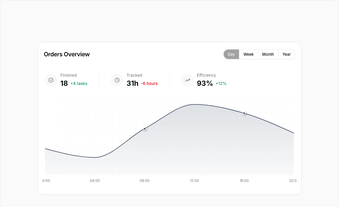
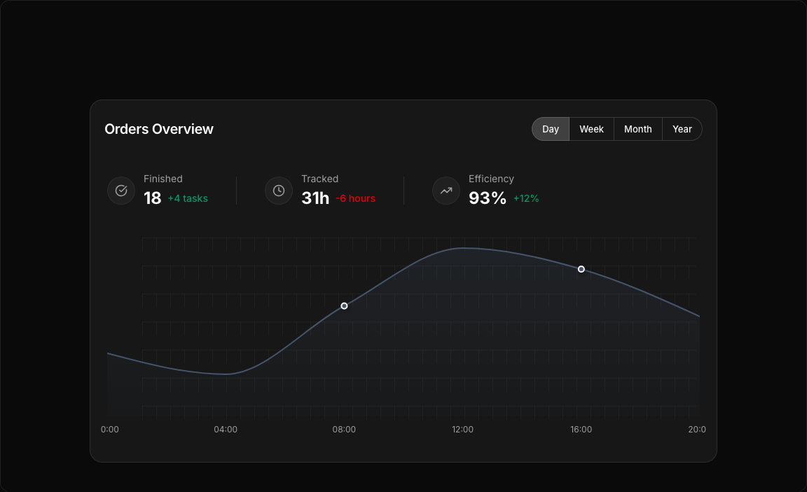
Area Chart 4 – Revenue & Task Statistics
A comprehensive dashboard combining subscription revenue tracking with task completion metrics. Features period toggle, gradient area visualization, and side statistics.
Key Features
- Period Toggle – Day, Week, Month, Year options.
- Revenue Area Chart – Slate-colored gradient fill.
- Task Statistics – Finished tasks and tracked hours.
- Trend Indicators – Positive/negative change badges.
- Custom Tooltip – Dark-themed hover information.
Visual Design
- Color Scheme – Slate-600 for professional appearance.
- Statistics Layout – Side-by-side with icons.
- Gradient Fill – Smooth area visualization.
Use Cases
- SaaS Dashboards – Track subscription revenue.
- Project Management – Monitor task completion.
- Agency Analytics – Track billable hours vs revenue.
- Team Performance – Combined productivity metrics.
Technical Stack
- Recharts – AreaChart with gradient fill.
- Tailwind CSS – Slate color palette.
- Radix UI – ToggleGroup, Card components.
- Lucide Icons – CheckCircle, Clock, TrendingUp.
Didn't find what you were looking for?
Suggest block