area-chart-5
Single block view - Copy and use this block in your project: area-chart-5
Loading...
charts/area-charts/area-chart-5.tsx
"use client";

import React, { useState } from "react";
import {
  Card,
  CardContent,
  CardHeader,
  CardHeading,
  CardTitle,
  CardToolbar,
} from "@/registry/default/ui/card/radix";
import {
  ChartConfig,
  ChartContainer,
  ChartTooltip,
} from "@/registry/default/ui/chart";
import {
  ToggleGroup,
  ToggleGroupItem,
} from "@/registry/default/ui/toggle-group";
import { Area, ComposedChart, Line, XAxis, YAxis } from "recharts";

// DeFi protocol financial data
const financeData = {
  day: [
    { month: "00:00", totalDeposits: 4.2, totalBorrowed: 3.1 },
    { month: "04:00", totalDeposits: 4.3, totalBorrowed: 3.2 },
    { month: "08:00", totalDeposits: 4.5, totalBorrowed: 3.3 },
    { month: "12:00", totalDeposits: 4.7, totalBorrowed: 3.3 },
    { month: "16:00", totalDeposits: 4.6, totalBorrowed: 3.2 },
    { month: "20:00", totalDeposits: 4.4, totalBorrowed: 3.1 },
  ],
  week: [
    { month: "Mon", totalDeposits: 4.2, totalBorrowed: 3.1 },
    { month: "Tue", totalDeposits: 4.3, totalBorrowed: 3.2 },
    { month: "Wed", totalDeposits: 4.5, totalBorrowed: 3.3 },
    { month: "Thu", totalDeposits: 4.7, totalBorrowed: 3.3 },
    { month: "Fri", totalDeposits: 4.6, totalBorrowed: 3.2 },
    { month: "Sat", totalDeposits: 4.4, totalBorrowed: 3.1 },
    { month: "Sun", totalDeposits: 4.3, totalBorrowed: 3.0 },
  ],
  month: [
    { month: "Jun", totalDeposits: 4.2, totalBorrowed: 3.1 },
    { month: "Jul", totalDeposits: 4.0, totalBorrowed: 2.9 },
    { month: "Aug", totalDeposits: 4.1, totalBorrowed: 3.0 },
    { month: "Sep", totalDeposits: 4.3, totalBorrowed: 3.1 },
    { month: "Oct", totalDeposits: 4.5, totalBorrowed: 3.2 },
    { month: "Nov", totalDeposits: 4.7, totalBorrowed: 3.3 },
    { month: "Dec", totalDeposits: 4.6, totalBorrowed: 3.2 },
    { month: "Jan", totalDeposits: 4.4, totalBorrowed: 3.1 },
    { month: "Feb", totalDeposits: 4.3, totalBorrowed: 3.0 },
    { month: "Mar", totalDeposits: 4.5, totalBorrowed: 3.2 },
    { month: "Apr", totalDeposits: 4.8, totalBorrowed: 3.4 },
    { month: "May", totalDeposits: 4.7, totalBorrowed: 3.3 },
  ],
};

const chartConfig = {
  totalDeposits: {
    label: "Total Deposits",
    color: "hsl(264, 82%, 70%)",
  },
  totalBorrowed: {
    label: "Total Borrowed",
    color: "hsl(172, 82%, 60%)",
  },
} satisfies ChartConfig;

// Custom Tooltip
interface TooltipProps {
  active?: boolean;
  payload?: Array<{
    dataKey: string;
    value: number;
    color: string;
  }>;
  label?: string;
}

const CustomTooltip = ({ active, payload, label }: TooltipProps) => {
  if (active && payload && payload.length) {
    // Filter to unique dataKeys to avoid duplicates from Area + Line components
    const uniquePayload = payload.filter(
      (entry, index, self) =>
        index === self.findIndex((item) => item.dataKey === entry.dataKey),
    );

    return (
      <div className="rounded-lg bg-zinc-800 border border-zinc-700 text-white p-3 shadow-lg">
        <div className="text-xs text-zinc-400 mb-2">{label}</div>
        {uniquePayload.map((entry, index) => (
          <div key={index} className="flex items-center gap-2 mb-1">
            <div
              className="w-2 h-2 rounded-full"
              style={{ backgroundColor: entry.color }}
            />
            <span className="text-sm text-zinc-300">
              {entry.dataKey === "totalDeposits"
                ? "Total Deposits"
                : "Total Borrowed"}
              :
            </span>
            <span className="font-semibold">${entry.value.toFixed(2)}M</span>
          </div>
        ))}
      </div>
    );
  }
  return null;
};

// Period configuration
const PERIODS = {
  day: { key: "day", label: "Day" },
  week: { key: "week", label: "Week" },
  month: { key: "month", label: "Month" },
} as const;

type PeriodKey = keyof typeof PERIODS;

export default function AreaChart5() {
  const [selectedPeriod, setSelectedPeriod] = useState<PeriodKey>("month");

  // Get data for selected period
  const currentData = financeData[selectedPeriod];

  // Calculate total values
  const latestData = currentData[currentData.length - 1];
  const totalValueLocked = latestData.totalDeposits + latestData.totalBorrowed;

  return (
    <div className="min-h-screen flex items-center justify-center p-6 lg:p-8">
      <Card className="w-full rounded-3xl lg:max-w-4xl bg-zinc-950 border-zinc-800 text-white">
        <CardHeader className="min-h-auto gap-5 p-8 border-0">
          <CardHeading className="flex flex-wrap items-end gap-5">
            <div className="min-w-40 space-y-0.5 me-2.5">
              <div className="text-sm text-zinc-400 mb-1">
                Total Value Locked
              </div>
              <div className="text-3xl leading-none font-bold">
                ${(totalValueLocked * 1000).toLocaleString()}.15
              </div>
            </div>
            <div className="flex items-center flex-wrap gap-2.5 mb-1.5">
              <div className="space-y-0.5 pe-10">
                <div
                  className="text-[11px] font-normal flex items-center gap-1.5"
                  style={{ color: chartConfig.totalDeposits.color }}
                >
                  <div
                    className="size-1.5 rounded-full "
                    style={{ backgroundColor: chartConfig.totalDeposits.color }}
                  />
                  Total Deposits
                </div>
                <div className="text-xl font-bold leading-none">
                  ${(latestData.totalDeposits * 1000).toLocaleString()}.43
                </div>
              </div>

              <div className="space-y-0.5">
                <div
                  className="text-[11px] font-normal flex items-center gap-1.5"
                  style={{ color: chartConfig.totalBorrowed.color }}
                >
                  <div
                    className="size-1.5 rounded-full "
                    style={{ backgroundColor: chartConfig.totalBorrowed.color }}
                  />
                  Total Borrowed
                </div>
                <div className="text-xl font-bold leading-none">
                  ${(latestData.totalBorrowed * 1000).toLocaleString()}.15
                </div>
              </div>
            </div>
          </CardHeading>
          <CardToolbar>
            <ToggleGroup
              type="single"
              value={selectedPeriod}
              onValueChange={(value) =>
                value && setSelectedPeriod(value as PeriodKey)
              }
              className="bg-zinc-800 p-1 rounded-full"
            >
              {Object.values(PERIODS).map((period) => (
                <ToggleGroupItem
                  key={period.key}
                  value={period.key}
                  className="px-4 py-2 text-sm data-[state=on]:bg-zinc-700 data-[state=on]:text-white text-zinc-400 hover:bg-zinc-700 hover:text-white rounded-full"
                >
                  {period.label}
                </ToggleGroupItem>
              ))}
            </ToggleGroup>
          </CardToolbar>
        </CardHeader>

        <CardContent className="ps-2.5 pe-4.5">
          <div className="h-[400px] w-full">
            <ChartContainer
              config={chartConfig}
              className="h-full w-full overflow-visible [&_.recharts-curve.recharts-tooltip-cursor]:stroke-initial"
            >
              <ComposedChart
                data={currentData}
                margin={{
                  top: 25,
                  right: 25,
                  left: 15,
                  bottom: 25,
                }}
                style={{ overflow: "visible" }}
              >
                <defs>
                  {/* Grid pattern */}
                  <pattern
                    id="gridPattern"
                    x="0"
                    y="0"
                    width="30"
                    height="30"
                    patternUnits="userSpaceOnUse"
                  >
                    <path
                      d="M 30 0 L 0 0 0 30"
                      fill="none"
                      stroke="rgb(51 65 85)"
                      strokeWidth="0.5"
                      strokeOpacity="0.3"
                    />
                  </pattern>

                  {/* Linear gradients for areas */}
                  <linearGradient
                    id="depositsAreaGradient"
                    x1="0"
                    y1="0"
                    x2="0"
                    y2="1"
                  >
                    <stop
                      offset="0%"
                      stopColor={chartConfig.totalDeposits.color}
                      stopOpacity="0.3"
                    />
                    <stop
                      offset="100%"
                      stopColor={chartConfig.totalDeposits.color}
                      stopOpacity="0.02"
                    />
                  </linearGradient>

                  <linearGradient
                    id="borrowedAreaGradient"
                    x1="0"
                    y1="0"
                    x2="0"
                    y2="1"
                  >
                    <stop
                      offset="0%"
                      stopColor={chartConfig.totalBorrowed.color}
                      stopOpacity="0.3"
                    />
                    <stop
                      offset="100%"
                      stopColor={chartConfig.totalBorrowed.color}
                      stopOpacity="0.02"
                    />
                  </linearGradient>

                  {/* Shadow filters for dots */}
                  <filter
                    id="dotShadow"
                    x="-100%"
                    y="-100%"
                    width="300%"
                    height="300%"
                  >
                    <feDropShadow
                      dx="2"
                      dy="2"
                      stdDeviation="3"
                      floodColor="rgba(0,0,0,0.4)"
                    />
                  </filter>
                  <filter
                    id="activeDotShadow"
                    x="-100%"
                    y="-100%"
                    width="300%"
                    height="300%"
                  >
                    <feDropShadow
                      dx="3"
                      dy="4"
                      stdDeviation="6"
                      floodColor="rgba(0,0,0,0.6)"
                    />
                  </filter>
                </defs>

                {/* Background grid */}
                <rect
                  x="0"
                  y="0"
                  width="100%"
                  height="100%"
                  fill="url(#gridPattern)"
                  style={{ pointerEvents: "none" }}
                />

                <XAxis
                  dataKey="month"
                  axisLine={false}
                  tickLine={false}
                  tick={{ fontSize: 12, fill: "rgb(148 163 184)" }}
                  tickMargin={15}
                />

                <YAxis
                  axisLine={false}
                  tickLine={false}
                  tick={{ fontSize: 12, fill: "rgb(148 163 184)" }}
                  tickFormatter={(value) => `$${value.toFixed(1)}M`}
                  domain={["dataMin - 0.2", "dataMax + 0.2"]}
                  tickMargin={15}
                />

                <ChartTooltip content={<CustomTooltip />} />

                {/* Area fills with gradients */}
                <Area
                  type="monotone"
                  dataKey="totalDeposits"
                  stroke="transparent"
                  fill="url(#depositsAreaGradient)"
                  strokeWidth={0}
                  dot={false}
                />

                <Area
                  type="monotone"
                  dataKey="totalBorrowed"
                  stroke="transparent"
                  fill="url(#borrowedAreaGradient)"
                  strokeWidth={0}
                  dot={false}
                />

                {/* Line strokes on top */}
                <Line
                  type="monotone"
                  dataKey="totalDeposits"
                  stroke={chartConfig.totalDeposits.color}
                  strokeWidth={2}
                  dot={{
                    r: 4,
                    fill: chartConfig.totalDeposits.color,
                    stroke: "white",
                    strokeWidth: 2,
                    filter: "url(#dotShadow)",
                  }}
                  activeDot={{
                    r: 6,
                    fill: chartConfig.totalDeposits.color,
                    strokeWidth: 2,
                    stroke: "white",
                    filter: "url(#activeDotShadow)",
                  }}
                />

                <Line
                  type="monotone"
                  dataKey="totalBorrowed"
                  stroke={chartConfig.totalBorrowed.color}
                  strokeWidth={2}
                  dot={{
                    r: 4,
                    fill: chartConfig.totalBorrowed.color,
                    stroke: "white",
                    strokeWidth: 2,
                    filter: "url(#dotShadow)",
                  }}
                  activeDot={{
                    r: 6,
                    fill: chartConfig.totalBorrowed.color,
                    strokeWidth: 2,
                    stroke: "white",
                    filter: "url(#activeDotShadow)",
                  }}
                />
              </ComposedChart>
            </ChartContainer>
          </div>
        </CardContent>
      </Card>
    </div>
  );
}
Component Data
- Name:
- Area Chart 5 – DeFi Protocol Finance Dashboard
- Access:
- Pro
- Created:
- 2025-12-01
- Updated:
- 2026-02-01
- Released:
- N/A
- Type:
- Block
area-chartchartdashboardanalyticsdeficryptofinancedepositsborrowedrechartstailwindreact
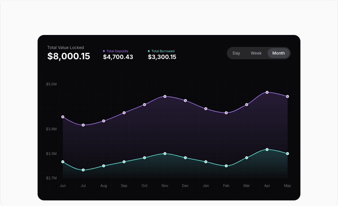
Area Chart 5 – DeFi Finance Dashboard
A sophisticated DeFi-style dashboard tracking Total Deposits against Total Borrowed amounts. Features dual gradient areas with line overlays and a dark theme optimized for crypto applications.
Key Features
- Dual Metrics – Total Deposits (purple) and Total Borrowed (teal).
- Period Toggle – Day, Week, Month view options.
- Gradient Areas – Semi-transparent fills with line overlays.
- Dark Tooltip – Zinc-themed hover with detailed values.
- Protocol Stats – Large metric displays with trends.
Visual Design
- Color Scheme – Purple (deposits), Teal (borrowed).
- Dark Theme – Zinc backgrounds for DeFi aesthetic.
- Layered Areas – Stacked visualization with transparency.
Use Cases
- DeFi Dashboards – Protocol TVL tracking.
- Crypto Analytics – Monitor lending/borrowing.
- Financial Apps – Asset vs liability visualization.
- Treasury Management – Track capital allocation.
Technical Stack
- Recharts – ComposedChart with Area and Line.
- Tailwind CSS – Purple/teal on dark backgrounds.
- Radix UI – ToggleGroup, Card components.
- Custom Gradients – SVG defs for fill effects.
Didn't find what you were looking for?
Suggest block