line-chart-2
Single block view - Copy and use this block in your project: line-chart-2
Loading...
charts/line-charts/line-chart-2.tsx
"use client";

import React, { useState } from "react";
import { Badge } from "@/registry/default/ui/badge/radix";
import {
  Card,
  CardContent,
  CardHeader,
  CardTitle,
  CardToolbar,
} from "@/registry/default/ui/card/radix";
import {
  ChartConfig,
  ChartContainer,
  ChartTooltip,
} from "@/registry/default/ui/chart";
import {
  Select,
  SelectContent,
  SelectItem,
  SelectTrigger,
} from "@/registry/default/ui/select/radix";
import { TrendingUp } from "lucide-react";
import {
  Area,
  CartesianGrid,
  ComposedChart,
  Line,
  XAxis,
  YAxis,
} from "recharts";

// Cashflow data for 12 months
const cashflowData = [
  { month: "JAN", value: 2100 },
  { month: "FEB", value: 2300 },
  { month: "MAR", value: 1900 },
  { month: "APR", value: 4800 },
  { month: "MAY", value: 5200 },
  { month: "JUN", value: 8900 },
  { month: "JUL", value: 6200 },
  { month: "AUG", value: 7100 },
  { month: "SEP", value: 9400 },
  { month: "OCT", value: 10200 },
  { month: "NOV", value: 11100 },
  { month: "DEC", value: 11800 },
];

// Use custom or Tailwind standard colors: https://tailwindcss.com/docs/colors
const chartConfig = {
  value: {
    label: "Cashflow",
    color: "var(--color-violet-500)",
  },
} satisfies ChartConfig;

// Custom Tooltip
interface TooltipProps {
  active?: boolean;
  payload?: Array<{
    dataKey: string;
    value: number;
    color: string;
  }>;
  label?: string;
}

const CustomTooltip = ({ active, payload }: TooltipProps) => {
  if (active && payload && payload.length) {
    return (
      <>
        <div className="rounded-lg bg-zinc-900 text-white p-3 shadow-lg">
          <div className="text-xs font-medium mb-1">Total:</div>
          <div className="text-sm font-semibold">
            ${payload[0].value.toLocaleString()}
          </div>
        </div>
      </>
    );
  }
  return null;
};

// Period configuration
const PERIODS = {
  "6m": {
    key: "6m",
    label: "6 months",
    dateRange: "Jul 01 - Dec 31, 2024",
  },
  "12m": {
    key: "12m",
    label: "12 months",
    dateRange: "Jan 01 - Dec 31, 2024",
  },
  "2y": {
    key: "2y",
    label: "2 years",
    dateRange: "Jan 01, 2023 - Dec 31, 2024",
  },
} as const;

type PeriodKey = keyof typeof PERIODS;

export default function LineChart2() {
  const [selectedPeriod, setSelectedPeriod] = useState<PeriodKey>("12m");

  // Filter data based on selected period
  const getFilteredData = () => {
    switch (selectedPeriod) {
      case "6m":
        return cashflowData.slice(-6);
      case "12m":
        return cashflowData;
      case "2y":
        // Simulate 2 years data by duplicating and modifying the current year
        const previousYear = cashflowData.map((item) => ({
          month: `${item.month} '23`,
          value: Math.round(item.value * 0.85), // 15% lower for previous year
        }));
        const currentYear = cashflowData.map((item) => ({
          month: `${item.month} '24`,
          value: item.value,
        }));
        return [...previousYear, ...currentYear];
      default:
        return cashflowData;
    }
  };

  const filteredData = getFilteredData();

  // Get current period configuration
  const currentPeriod = PERIODS[selectedPeriod];

  // Calculate total and percentage based on filtered data
  const totalCash = filteredData.reduce((sum, item) => sum + item.value, 0);
  const lastValue = filteredData[filteredData.length - 1]?.value || 0;
  const previousValue = filteredData[filteredData.length - 2]?.value || 0;
  const percentageChange =
    previousValue > 0 ? ((lastValue - previousValue) / previousValue) * 100 : 0;

  return (
    <div className="min-h-screen flex items-center justify-center p-6 lg:p-8">
      <Card className="w-full lg:max-w-4xl ">
        <CardHeader className="border-0 min-h-auto pt-6 pb-4">
          <CardTitle className="text-lg font-semibold">Cashflow</CardTitle>
          <CardToolbar>
            <Select
              value={selectedPeriod}
              onValueChange={(value) => setSelectedPeriod(value as PeriodKey)}
            >
              <SelectTrigger>{currentPeriod.label}</SelectTrigger>
              <SelectContent align="end">
                {Object.values(PERIODS).map((period) => (
                  <SelectItem key={period.key} value={period.key}>
                    {period.label}
                  </SelectItem>
                ))}
              </SelectContent>
            </Select>
          </CardToolbar>
        </CardHeader>

        <CardContent className="px-0">
          {/* Stats Section */}
          <div className="px-5 mb-8">
            <div className="text-xs font-medium text-muted-foreground tracking-wide mb-2">
              {currentPeriod.dateRange}
            </div>
            <div className="flex items-center gap-3 mb-4">
              <div className="text-3xl font-bold">
                ${totalCash.toLocaleString()}
              </div>
              <Badge variant="success" appearance="light">
                <TrendingUp className="size-3" />
                {Math.abs(percentageChange).toFixed(2)}%
              </Badge>
            </div>
          </div>

          {/* Chart */}
          <div className="relative">
            <ChartContainer
              config={chartConfig}
              className="h-[300px] w-full ps-1.5 pe-2.5 overflow-visible [&_.recharts-curve.recharts-tooltip-cursor]:stroke-initial"
            >
              <ComposedChart
                data={filteredData}
                margin={{
                  top: 25,
                  right: 25,
                  left: 0,
                  bottom: 25,
                }}
                style={{ overflow: "visible" }}
              >
                {/* Gradient */}
                <defs>
                  <linearGradient
                    id="cashflowGradient"
                    x1="0"
                    y1="0"
                    x2="0"
                    y2="1"
                  >
                    <stop
                      offset="0%"
                      stopColor={chartConfig.value.color}
                      stopOpacity={0.15}
                    />
                    <stop
                      offset="100%"
                      stopColor={chartConfig.value.color}
                      stopOpacity={0}
                    />
                  </linearGradient>
                  <filter
                    id="dotShadow"
                    x="-50%"
                    y="-50%"
                    width="200%"
                    height="200%"
                  >
                    <feDropShadow
                      dx="2"
                      dy="2"
                      stdDeviation="3"
                      floodColor="rgba(0,0,0,0.5)"
                    />
                  </filter>
                </defs>

                <CartesianGrid
                  strokeDasharray="4 12"
                  stroke="var(--input)"
                  strokeOpacity={1}
                  horizontal={true}
                  vertical={false}
                />

                <XAxis
                  dataKey="month"
                  axisLine={false}
                  tickLine={false}
                  tick={{ fontSize: 12 }}
                  tickMargin={12}
                  dy={10}
                />

                <YAxis
                  axisLine={false}
                  tickLine={false}
                  tick={{ fontSize: 12 }}
                  tickFormatter={(value) => `${value / 1000}K`}
                  domain={[0, "dataMax + 1000"]}
                  tickCount={6}
                  tickMargin={12}
                />

                <ChartTooltip
                  content={<CustomTooltip />}
                  cursor={{
                    stroke: chartConfig.value.color,
                    strokeWidth: 1,
                    strokeDasharray: "none",
                  }}
                />

                {/* Gradient area */}
                <Area
                  type="linear"
                  dataKey="value"
                  stroke="transparent"
                  fill="url(#cashflowGradient)"
                  strokeWidth={0}
                  dot={false}
                />

                {/* Main cashflow line */}
                <Line
                  type="linear"
                  dataKey="value"
                  stroke={chartConfig.value.color}
                  strokeWidth={3}
                  dot={(props) => {
                    const { cx, cy, payload } = props;
                    if (payload.month === "JUN" || payload.month === "NOV") {
                      return (
                        <circle
                          key={`dot-${cx}-${cy}`}
                          cx={cx}
                          cy={cy}
                          r={6}
                          fill={chartConfig.value.color}
                          stroke="white"
                          strokeWidth={2}
                          filter="url(#dotShadow)"
                        />
                      );
                    }
                    return <g key={`dot-${cx}-${cy}`} />; // Return empty group for other points
                  }}
                  activeDot={{
                    r: 6,
                    fill: chartConfig.value.color,
                    stroke: "white",
                    strokeWidth: 2,
                    filter: "url(#dotShadow)",
                  }}
                />
              </ComposedChart>
            </ChartContainer>
          </div>
        </CardContent>
      </Card>
    </div>
  );
}
Component Data
- Name:
- Line Chart 2 – Cashflow Analytics with Period Selector
- Access:
- Pro
- Created:
- 2025-12-01
- Updated:
- 2026-02-01
- Released:
- N/A
- Type:
- Block
line-chartchartdashboardanalyticscashflowfinancegradientrechartstailwindreact
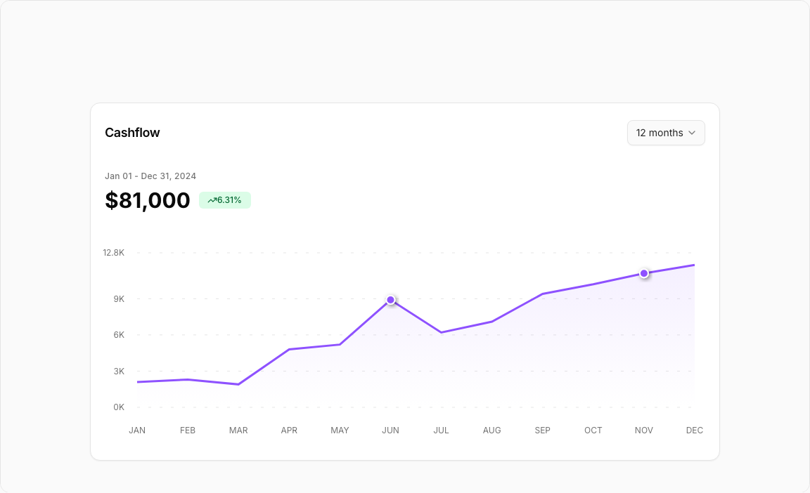
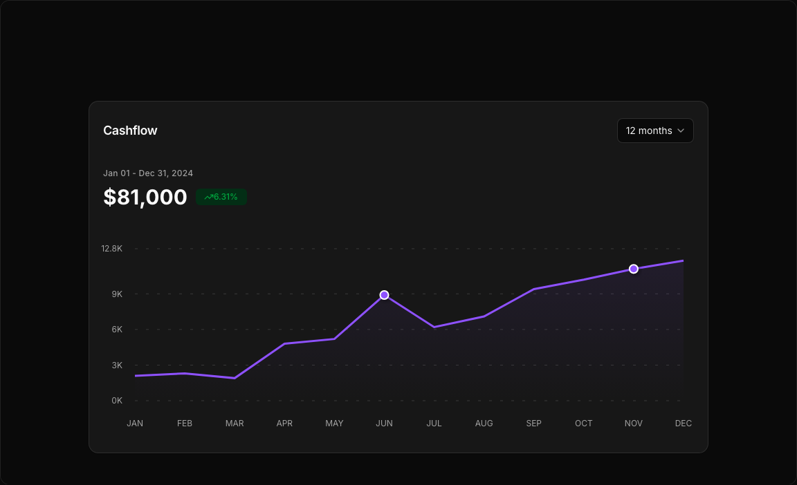
Line Chart 2 – Cashflow Trend Chart
An elegant cashflow analytics chart with smooth gradient fills and interactive period selection. Perfect for financial dashboards, accounting software, and business intelligence tools.
Key Features
- Gradient Area Fill – Beautiful violet gradient under the line for visual depth.
- Period Selector – Dropdown to switch between 6 months, 12 months, or 2 years.
- Trend Indicator – TrendingUp icon with growth percentage badge.
- Custom Tooltip – Dark-themed tooltip showing total values.
- Grid Background – Subtle grid lines for value reference.
Visual Design
- Color Scheme – Violet-500 primary color with gradient fill.
- Dark Tooltip – Zinc-900 background for high contrast.
- Clean Layout – Minimal borders with focused data presentation.
Use Cases
- Accounting Dashboards – Track monthly cashflow trends.
- Financial Planning – Visualize revenue projections.
- Business Analytics – Monitor cash positions over time.
- Investment Tracking – Display portfolio value changes.
Technical Stack
- Recharts – ComposedChart with Area, Line, CartesianGrid.
- Tailwind CSS – Violet color palette with gradients.
- Radix UI – Select, Card, and Badge components.
- Lucide Icons – TrendingUp indicator.
Didn't find what you were looking for?
Suggest block