statistic-card-12
Single block view - Copy and use this block in your project: statistic-card-12
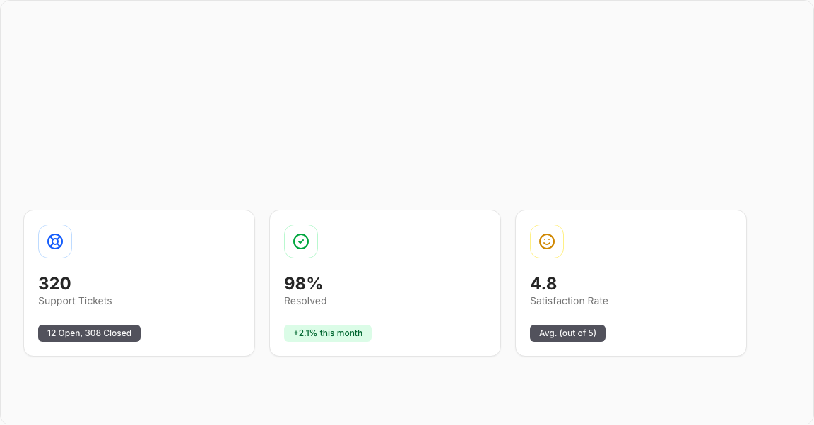
Statistic Card 12 – Support Metrics Cards
A trio of customer support KPI cards with distinctive bordered circular icons. Displays ticket volume, resolution stats, and customer satisfaction metrics.
Key Features
- Three Metrics – Total Tickets, Resolved, Satisfaction Rate.
- Bordered Icons – Round containers with colored borders.
- Info Badges – Additional context (e.g., "12 pending").
- Container Queries – Responsive icon sizing.
- Clean Layout – Minimal, focused design.
Visual Design
- Icon Colors – Blue (Tickets), Green (Resolved), Yellow (Satisfaction).
- Round Borders – Circular icon containers.
- Badge Indicators – Secondary info badges.
Use Cases
- Support Dashboards – Help desk metrics.
- Customer Service – Ticket tracking displays.
- Quality Monitoring – Satisfaction score tracking.
- Operations Centers – Service level monitoring.
Technical Stack
- React – Component with metric configurations.
- Tailwind CSS – Container query classes.
- Radix UI – Card, Badge components.
- Lucide Icons – LifeBuoy, CheckCircle2, Smile.
Didn't find what you were looking for?
Suggest block