line-chart-4
Single block view - Copy and use this block in your project: line-chart-4
Loading...
charts/line-charts/line-chart-4.tsx
"use client";

import React from "react";
import { Button } from "@/registry/default/ui/button/radix";
import {
  Card,
  CardContent,
  CardHeader,
  CardTitle,
  CardToolbar,
} from "@/registry/default/ui/card/radix";
import {
  ChartConfig,
  ChartContainer,
  ChartTooltip,
  ChartTooltipContent,
} from "@/registry/default/ui/chart";
import {
  DropdownMenu,
  DropdownMenuContent,
  DropdownMenuItem,
  DropdownMenuSeparator,
  DropdownMenuTrigger,
} from "@/registry/default/ui/dropdown-menu";
import {
  Calendar,
  Download,
  Filter,
  MoreHorizontal,
  RefreshCw,
  Share2,
} from "lucide-react";
import { CartesianGrid, Line, LineChart, XAxis, YAxis } from "recharts";

// Social media engagement data throughout the day (percentage)
const engagementData = [
  { time: "6AM", facebook: 2, instagram: 8, linkedin: 5 },
  { time: "7AM", facebook: 5, instagram: 12, linkedin: 8 },
  { time: "8AM", facebook: 8, instagram: 18, linkedin: 15 },
  { time: "9AM", facebook: 12, instagram: 25, linkedin: 22 },
  { time: "10AM", facebook: 15, instagram: 35, linkedin: 28 },
  { time: "11AM", facebook: 18, instagram: 42, linkedin: 32 },
  { time: "12PM", facebook: 22, instagram: 38, linkedin: 35 },
  { time: "1PM", facebook: 25, instagram: 45, linkedin: 30 },
  { time: "2PM", facebook: 28, instagram: 48, linkedin: 33 },
  { time: "3PM", facebook: 30, instagram: 52, linkedin: 38 },
  { time: "4PM", facebook: 26, instagram: 46, linkedin: 35 },
  { time: "5PM", facebook: 24, instagram: 44, linkedin: 32 },
  { time: "6PM", facebook: 22, instagram: 40, linkedin: 28 },
  { time: "7PM", facebook: 20, instagram: 38, linkedin: 25 },
  { time: "8PM", facebook: 18, instagram: 35, linkedin: 22 },
];

// Use custom or Tailwind standard colors: https://tailwindcss.com/docs/colors
const chartConfig = {
  facebook: {
    label: "Facebook",
    color: "var(--color-blue-600)",
  },
  instagram: {
    label: "Instagram",
    color: "var(--color-orange-500)",
  },
  linkedin: {
    label: "LinkedIn",
    color: "var(--color-slate-600)",
  },
} satisfies ChartConfig;

// Custom Tooltip
interface TooltipProps {
  active?: boolean;
  payload?: Array<{
    dataKey: string;
    value: number;
    color: string;
  }>;
  label?: string;
}

const ChartLabel = ({ label, color }: { label: string; color: string }) => {
  return (
    <div className="flex items-center gap-1.5">
      <div
        className="size-3.5 border-4 rounded-full bg-background"
        style={{ borderColor: color }}
      ></div>
      <span className="text-muted-foreground">{label}</span>
    </div>
  );
};

const CustomTooltip = ({ active, payload, label }: TooltipProps) => {
  if (active && payload && payload.length) {
    return (
      <div className="rounded-lg border bg-popover p-3 shadow-sm shadow-black/5 min-w-[150px]">
        <div className="text-xs font-medium text-muted-foreground tracking-wide mb-2.5">
          {label}
        </div>
        <div className="space-y-2">
          {payload.map((entry, index) => {
            const config =
              chartConfig[entry.dataKey as keyof typeof chartConfig];
            return (
              <div key={index} className="flex items-center gap-2 text-xs">
                <ChartLabel label={config?.label + ":"} color={entry.color} />
                <span className="font-semibold text-popover-foreground">
                  {entry.value}%
                </span>
              </div>
            );
          })}
        </div>
      </div>
    );
  }
  return null;
};

// Chart Legend Component
const ChartLegend = ({ label, color }: { label: string; color: string }) => {
  return (
    <div className="flex items-center gap-2">
      <div
        className="size-3.5 border-4 rounded-full bg-background border-border"
        style={{ borderColor: `${color}` }}
      ></div>
      <span className="text-sm text-muted-foreground">{label}</span>
    </div>
  );
};

export default function LineChart4() {
  return (
    <div className="min-h-screen flex items-center justify-center p-6 lg:p-8">
      <Card className="w-full max-w-2xl">
        <CardHeader className="border-0 pt-6 pb-4">
          <CardTitle className="text-lg font-semibold">
            Social Media Activity
          </CardTitle>
          <CardToolbar>
            <DropdownMenu>
              <DropdownMenuTrigger asChild>
                <Button variant="ghost" size="sm" className="h-8 w-8 p-0">
                  <MoreHorizontal className="h-4 w-4" />
                </Button>
              </DropdownMenuTrigger>
              <DropdownMenuContent align="end">
                <DropdownMenuItem>
                  <Download className="h-4 w-4" />
                  Export Data
                </DropdownMenuItem>
                <DropdownMenuItem>
                  <Calendar className="h-4 w-4" />
                  Change Date
                </DropdownMenuItem>
                <DropdownMenuItem>
                  <Filter className="h-4 w-4" />
                  Filter Platforms
                </DropdownMenuItem>
                <DropdownMenuItem>
                  <RefreshCw className="h-4 w-4" />
                  Refresh
                </DropdownMenuItem>
                <DropdownMenuSeparator />
                <DropdownMenuItem>
                  <Share2 className="h-4 w-4" />
                  Share Report
                </DropdownMenuItem>
              </DropdownMenuContent>
            </DropdownMenu>
          </CardToolbar>
        </CardHeader>

        <CardContent className="ps-0 pe-4.5 pb-6">
          <ChartContainer
            config={chartConfig}
            className="h-[200px] w-full mb-6 [&_.recharts-curve.recharts-tooltip-cursor]:stroke-initial"
          >
            <LineChart
              data={engagementData}
              margin={{
                top: 5,
                right: 5,
                left: 5,
                bottom: 5,
              }}
            >
              <CartesianGrid
                strokeDasharray="4 8"
                stroke="var(--input)"
                strokeOpacity={1}
                horizontal={true}
                vertical={false}
              />

              <XAxis
                dataKey="time"
                axisLine={false}
                tickLine={false}
                tick={{ fontSize: 11, fill: "var(--text-muted-foreground)" }}
                tickMargin={10}
              />

              <YAxis
                axisLine={false}
                tickLine={false}
                tick={{ fontSize: 11, fill: "var(--text-muted-foreground)" }}
                tickFormatter={(value) => `${value}%`}
                domain={[0, 60]}
                tickMargin={10}
              />

              <ChartTooltip
                content={<CustomTooltip />}
                cursor={{ strokeDasharray: "3 3", stroke: "var(--input)" }}
              />

              {/* Facebook Line */}
              <Line
                dataKey="facebook"
                type="monotone"
                stroke="var(--color-facebook)"
                strokeWidth={2}
                dot={false}
              />

              {/* Instagram Line */}
              <Line
                dataKey="instagram"
                type="monotone"
                stroke="var(--color-instagram)"
                strokeWidth={2}
                dot={false}
              />

              {/* LinkedIn Line */}
              <Line
                dataKey="linkedin"
                type="monotone"
                stroke="var(--color-linkedin)"
                strokeWidth={2}
                dot={false}
              />
            </LineChart>
          </ChartContainer>

          {/* Legend */}
          <div className="flex items-center justify-center gap-6">
            <ChartLegend label="Facebook" color={chartConfig.facebook.color} />
            <ChartLegend
              label="Instagram"
              color={chartConfig.instagram.color}
            />
            <ChartLegend label="LinkedIn" color={chartConfig.linkedin.color} />
          </div>
        </CardContent>
      </Card>
    </div>
  );
}
Component Data
- Name:
- Line Chart 4 – Social Media Engagement Analytics
- Access:
- Pro
- Created:
- 2025-12-01
- Updated:
- 2026-02-01
- Released:
- N/A
- Type:
- Block
line-chartchartdashboardanalyticssocial-mediafacebookinstagramlinkedinrechartstailwindreact
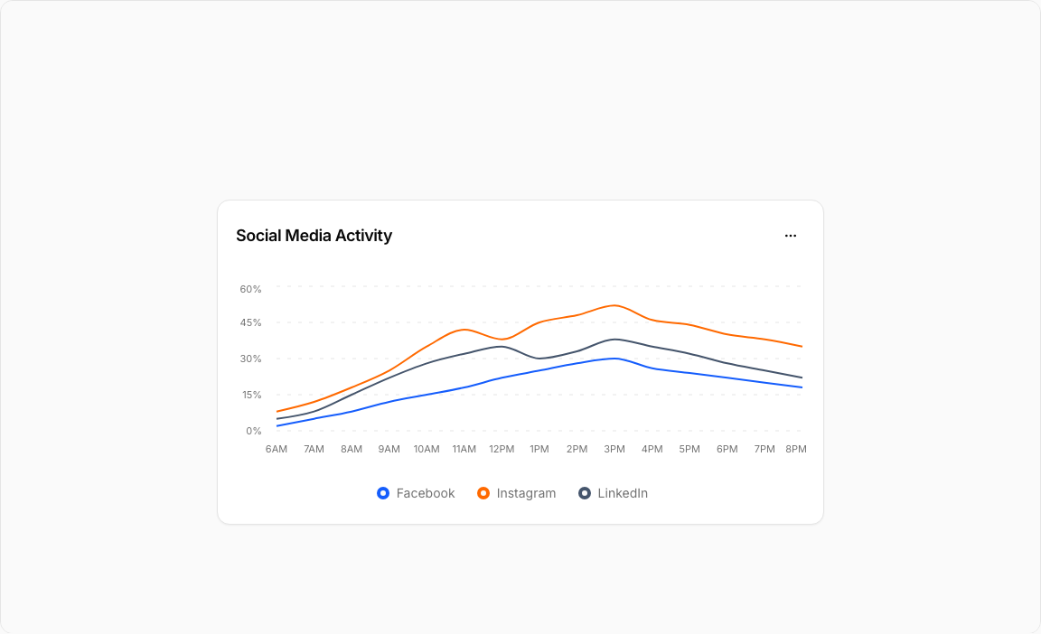
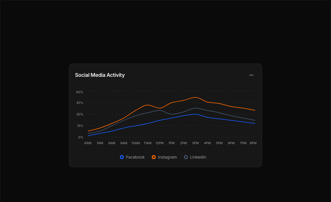
Line Chart 4 – Social Media Activity Chart
A comprehensive multi-platform social media analytics chart. Tracks engagement percentages across Facebook, Instagram, and LinkedIn throughout the day with distinct color coding.
Key Features
- Three Data Series – Facebook (blue), Instagram (orange), LinkedIn (slate).
- Hourly Tracking – Engagement data from 6AM to 8PM.
- Legend Display – Color-coded platform labels below chart.
- Custom Tooltips – Hover to see percentage values for all platforms.
- Action Menu – Filter, export, share, and refresh options.
Visual Design
- Color Scheme – Blue-600 (Facebook), Orange-500 (Instagram), Slate-600 (LinkedIn).
- Clean Grid – Dashed vertical grid lines for time reference.
- Bordered Legend – Circle indicators with platform names.
Use Cases
- Social Media Dashboards – Monitor engagement across platforms.
- Marketing Analytics – Identify peak activity times.
- Content Planning – Optimize posting schedules.
- Campaign Tracking – Measure social campaign performance.
Technical Stack
- Recharts – LineChart with multiple Line components.
- Tailwind CSS – Platform-specific color palette.
- Radix UI – Card, DropdownMenu, Button components.
- Lucide Icons – Calendar, Download, Filter, Share2, etc.
Didn't find what you were looking for?
Suggest block