line-chart-5
Single block view - Copy and use this block in your project: line-chart-5
Loading...
charts/line-charts/line-chart-5.tsx
"use client";

import React, { useState } from "react";
import { Badge } from "@/registry/default/ui/badge/radix";
import {
  Card,
  CardContent,
  CardHeader,
  CardTitle,
  CardToolbar,
} from "@/registry/default/ui/card/radix";
import {
  ChartConfig,
  ChartContainer,
  ChartTooltip,
} from "@/registry/default/ui/chart";
import {
  Select,
  SelectContent,
  SelectItem,
  SelectTrigger,
  SelectValue,
} from "@/registry/default/ui/select/radix";
import { TrendingDown, TrendingUp } from "lucide-react";
import {
  Area,
  CartesianGrid,
  ComposedChart,
  Line,
  XAxis,
  YAxis,
} from "recharts";

// E-commerce data for different periods with balanced patterns
const salesViewsData = {
  "7d": [
    { period: "Aug 1", sales: 850, views: 620 },
    { period: "Aug 5", sales: 920, views: 780 },
    { period: "Aug 7", sales: 780, views: 540 },
    { period: "Aug 8", sales: 1240, views: 890 },
    { period: "Aug 22", sales: 1100, views: 720 },
  ],
  "30d": [
    { period: "Week 1", sales: 5200, views: 4800 },
    { period: "Week 2", sales: 6400, views: 5200 },
    { period: "Week 3", sales: 5800, views: 4600 },
    { period: "Week 4", sales: 7200, views: 5800 },
    { period: "Week 5", sales: 6800, views: 5400 },
    { period: "Week 6", sales: 6200, views: 4900 },
  ],
  "90d": [
    { period: "Jan", sales: 22000, views: 18500 },
    { period: "Feb", sales: 24800, views: 20200 },
    { period: "Mar", sales: 21400, views: 17800 },
    { period: "Apr", sales: 26200, views: 21600 },
    { period: "May", sales: 25600, views: 20800 },
    { period: "Jun", sales: 27400, views: 22400 },
    { period: "Jul", sales: 24800, views: 19600 },
    { period: "Aug", sales: 23600, views: 18800 },
    { period: "Sep", sales: 28200, views: 23200 },
  ],
  "12m": [
    { period: "Q1 23", sales: 85000, views: 72000 },
    { period: "Q2 23", sales: 92000, views: 78000 },
    { period: "Q3 23", sales: 88000, views: 74000 },
    { period: "Q4 23", sales: 98000, views: 82000 },
    { period: "Q1 24", sales: 94000, views: 79000 },
    { period: "Q2 24", sales: 102000, views: 86000 },
    { period: "Q3 24", sales: 96000, views: 81000 },
    { period: "Q4 24", sales: 108000, views: 90000 },
  ],
};

// Use custom or Tailwind standard colors: https://tailwindcss.com/docs/colors
const chartConfig = {
  sales: {
    label: "Sales",
    color: "var(--color-amber-500)",
  },
  views: {
    label: "Views",
    color: "var(--color-purple-500)",
  },
} satisfies ChartConfig;

// Custom Tooltip
interface TooltipProps {
  active?: boolean;
  payload?: Array<{
    dataKey: string;
    value: number;
    color: string;
  }>;
  label?: string;
}

const ChartLabel = ({ label, color }: { label: string; color: string }) => {
  return (
    <div className="flex items-center gap-1.5">
      <div
        className="w-1 h-3 rounded-full"
        style={{ backgroundColor: color }}
      ></div>
      <span className="text-muted-foreground">{label}</span>
    </div>
  );
};

const CustomTooltip = ({ active, payload, label }: TooltipProps) => {
  if (active && payload && payload.length) {
    return (
      <div className="rounded-lg border bg-popover p-3 shadow-sm shadow-black/5 min-w-[150px]">
        <div className="text-xs font-medium text-muted-foreground tracking-wide mb-2.5">
          {label}
        </div>
        <div className="space-y-2">
          {payload.map((entry, index) => {
            const config =
              chartConfig[entry.dataKey as keyof typeof chartConfig];
            return (
              <div key={index} className="flex items-center gap-2 text-xs">
                <ChartLabel label={config?.label + ":"} color={entry.color} />
                <span className="font-semibold text-popover-foreground">
                  {entry.dataKey === "sales"
                    ? `£${entry.value.toLocaleString()}`
                    : entry.value >= 0
                      ? `+${entry.value.toLocaleString()}`
                      : entry.value.toLocaleString()}
                </span>
              </div>
            );
          })}
        </div>
      </div>
    );
  }
  return null;
};

// Period configuration
const PERIODS = {
  "7d": { key: "7d", label: "Last 7 days" },
  "30d": { key: "30d", label: "Last 30 days" },
  "90d": { key: "90d", label: "Last 90 days" },
  "12m": { key: "12m", label: "Last 12 months" },
} as const;

type PeriodKey = keyof typeof PERIODS;

export default function LineChart5() {
  const [selectedPeriod, setSelectedPeriod] = useState<PeriodKey>("30d");

  // Get data for selected period
  const currentData = salesViewsData[selectedPeriod];

  // Calculate totals and percentages
  const totalSales = currentData.reduce((sum, item) => sum + item.sales, 0);
  const totalViews = currentData.reduce((sum, item) => sum + item.views, 0);
  // Calculate percentage changes (simulated)
  const salesChange =
    selectedPeriod === "7d"
      ? 12
      : selectedPeriod === "30d"
        ? 8
        : selectedPeriod === "90d"
          ? -3
          : 15;
  const viewsChange =
    selectedPeriod === "7d"
      ? -3
      : selectedPeriod === "30d"
        ? 5
        : selectedPeriod === "90d"
          ? -8
          : 12;

  return (
    <div className="min-h-screen flex items-center justify-center p-6 lg:p-8">
      <Card className="w-full max-w-3xl">
        <CardHeader className="border-0 min-h-auto pt-6 pb-4">
          <CardTitle className="text-lg font-semibold">
            E-commerce Sales
          </CardTitle>
          <CardToolbar>
            {/* Period Selector */}
            <Select
              value={selectedPeriod}
              onValueChange={(value) => setSelectedPeriod(value as PeriodKey)}
            >
              <SelectTrigger>
                <SelectValue />
              </SelectTrigger>
              <SelectContent align="end">
                {Object.values(PERIODS).map((period) => (
                  <SelectItem key={period.key} value={period.key}>
                    {period.label}
                  </SelectItem>
                ))}
              </SelectContent>
            </Select>
          </CardToolbar>
        </CardHeader>

        <CardContent className="px-2 pb-6">
          {/* Stats Section */}
          <div className="flex items-center flex-wrap gap-3.5 md:gap-10 px-5 mb-8 text-sm">
            <div className="flex items-center gap-3.5">
              <ChartLabel label="Sales" color={chartConfig.sales.color} />
              <div className="flex items-center gap-2">
                <span className="text-2xl font-bold">
                  £{totalSales.toLocaleString()}
                </span>
                <Badge
                  variant={salesChange >= 0 ? "success" : "destructive"}
                  appearance="light"
                >
                  {salesChange >= 0 ? (
                    <TrendingUp className="size-3" />
                  ) : (
                    <TrendingDown className="size-3" />
                  )}
                  {Math.abs(salesChange)}%
                </Badge>
              </div>
            </div>
            <div className="flex items-center gap-3.5">
              <ChartLabel label="Views" color={chartConfig.views.color} />
              <div className="flex items-center gap-2">
                <span className="text-2xl font-bold">
                  {totalViews.toLocaleString()}
                </span>
                <Badge
                  variant={salesChange <= 0 ? "success" : "destructive"}
                  appearance="light"
                >
                  {viewsChange <= 0 ? (
                    <TrendingUp className="size-3" />
                  ) : (
                    <TrendingDown className="size-3" />
                  )}
                  {Math.abs(viewsChange)}%
                </Badge>
              </div>
            </div>
          </div>

          {/* Chart */}
          <ChartContainer
            config={chartConfig}
            className="h-[300px] w-full [&_.recharts-curve.recharts-tooltip-cursor]:stroke-initial"
          >
            <ComposedChart
              data={currentData}
              margin={{
                top: 30,
                right: 5,
                left: 5,
                bottom: 10,
              }}
            >
              {/* Background pattern for chart area only */}
              <defs>
                <linearGradient id="salesGradient" x1="0" y1="0" x2="0" y2="1">
                  <stop
                    offset="0%"
                    stopColor={chartConfig.sales.color}
                    stopOpacity={0.3}
                  />
                  <stop
                    offset="100%"
                    stopColor={chartConfig.sales.color}
                    stopOpacity={0.05}
                  />
                </linearGradient>
                <linearGradient id="viewsGradient" x1="0" y1="0" x2="0" y2="1">
                  <stop
                    offset="0%"
                    stopColor={chartConfig.views.color}
                    stopOpacity={0.3}
                  />
                  <stop
                    offset="100%"
                    stopColor={chartConfig.views.color}
                    stopOpacity={0.05}
                  />
                </linearGradient>
                <filter id="glow">
                  <feGaussianBlur stdDeviation="3" result="coloredBlur" />
                  <feMerge>
                    <feMergeNode in="coloredBlur" />
                    <feMergeNode in="SourceGraphic" />
                  </feMerge>
                </filter>
              </defs>

              <CartesianGrid
                strokeDasharray="4 12"
                stroke="var(--input)"
                strokeOpacity={1}
                horizontal={true}
                vertical={false}
              />

              {/* X Axis */}
              <XAxis
                dataKey="period"
                axisLine={false}
                tickLine={false}
                tick={{ fontSize: 11, fill: "var(--muted-foreground)" }}
                tickMargin={10}
              />

              {/* Left Y Axis for Sales */}
              <YAxis
                yAxisId="sales"
                orientation="left"
                axisLine={false}
                tickLine={false}
                tick={{ fontSize: 11, fill: "var(--muted-foreground)" }}
                tickFormatter={(value) =>
                  selectedPeriod === "7d"
                    ? `£${value}`
                    : `£${(value / 1000).toFixed(0)}k`
                }
                tickMargin={10}
              />
              {/* Right Y Axis for Views */}
              <YAxis
                yAxisId="views"
                orientation="right"
                axisLine={false}
                tickLine={false}
                tick={{ fontSize: 11, fill: "var(--muted-foreground)" }}
                tickFormatter={(value) => {
                  if (selectedPeriod === "7d") {
                    return value >= 0 ? `+${value}` : value.toString();
                  }
                  return value >= 0
                    ? `+${(value / 1000).toFixed(0)}k`
                    : `${(value / 1000).toFixed(0)}k`;
                }}
                tickMargin={8}
                domain={["dataMin - 100", "dataMax + 100"]}
              />

              <ChartTooltip
                content={<CustomTooltip />}
                cursor={{
                  strokeDasharray: "3 3",
                  stroke: "var(--muted-foreground)",
                  strokeOpacity: 0.5,
                }}
              />

              {/* Sales Line (Linear) */}
              <Line
                yAxisId="sales"
                type="linear"
                dataKey="sales"
                stroke={chartConfig.sales.color}
                strokeWidth={1}
                dot={false}
                activeDot={{
                  r: 5,
                  fill: chartConfig.sales.color,
                  strokeWidth: 0,
                }}
              />

              {/* Views Line (Linear Dashed) */}
              <Line
                yAxisId="views"
                type="linear"
                dataKey="views"
                stroke={chartConfig.views.color}
                strokeWidth={1}
                strokeDasharray="8 4"
                dot={false}
                activeDot={{
                  r: 5,
                  fill: chartConfig.views.color,
                  strokeWidth: 0,
                }}
              />
            </ComposedChart>
          </ChartContainer>
        </CardContent>
      </Card>
    </div>
  );
}
Component Data
- Name:
- Line Chart 5 – E-commerce Sales vs Views
- Access:
- Pro
- Created:
- 2025-12-01
- Updated:
- 2026-02-01
- Released:
- N/A
- Type:
- Block
line-chartarea-chartchartdashboardanalyticsecommercesalesviewsrechartstailwindreact
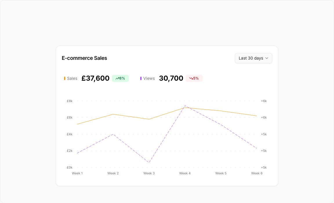
Line Chart 5 – E-commerce Sales & Views
A sophisticated e-commerce analytics chart comparing sales performance with product views. Features dual gradient areas and a flexible period selector for comprehensive trend analysis.
Key Features
- Dual Metrics – Sales (amber) and Views (purple) comparison.
- Period Selector – 7D, 30D, 90D, 12M dropdown options.
- Gradient Areas – Semi-transparent fills under both lines.
- Trend Badges – TrendingUp/Down icons with percentage changes.
- Custom Tooltips – Detailed hover information for both metrics.
Visual Design
- Color Scheme – Amber-500 (sales), Purple-500 (views).
- Gradient Fills – Smooth opacity transitions to background.
- Clean Header – Period selector and action controls.
Use Cases
- E-commerce Dashboards – Track sales vs traffic correlation.
- Product Analytics – Measure conversion from views to sales.
- Marketing ROI – Analyze traffic quality impact on revenue.
- Seasonal Trends – Identify sales patterns across periods.
Technical Stack
- Recharts – ComposedChart with Area and Line components.
- Tailwind CSS – Amber and purple color palette.
- Radix UI – Select, Card, Badge components.
- Lucide Icons – TrendingUp, TrendingDown indicators.
Didn't find what you were looking for?
Suggest block