line-chart-6
Single block view - Copy and use this block in your project: line-chart-6
Loading...
charts/line-charts/line-chart-6.tsx
"use client";

import React, { useState } from "react";
import { Badge } from "@/registry/default/ui/badge/radix";
import {
  Card,
  CardContent,
  CardHeader,
} from "@/registry/default/ui/card/radix";
import {
  ChartConfig,
  ChartContainer,
  ChartTooltip,
} from "@/registry/default/ui/chart";
import { ArrowDown, ArrowUp } from "lucide-react";
import { Line, LineChart, XAxis, YAxis } from "recharts";
import { cn } from "@/lib/utils";

// E-commerce platform metrics data (adapted from interactive chart example)
const platformData = [
  {
    date: "2024-04-01",
    orders: 222,
    response: 150,
    revenue: 8.2,
    customers: 420,
  },
  {
    date: "2024-04-02",
    orders: 97,
    response: 180,
    revenue: 4.5,
    customers: 290,
  },
  {
    date: "2024-04-03",
    orders: 167,
    response: 120,
    revenue: 6.8,
    customers: 380,
  },
  {
    date: "2024-04-04",
    orders: 242,
    response: 260,
    revenue: 9.1,
    customers: 520,
  },
  {
    date: "2024-04-05",
    orders: 301,
    response: 340,
    revenue: 11.2,
    customers: 620,
  },
  {
    date: "2024-04-06",
    orders: 59,
    response: 110,
    revenue: 2.8,
    customers: 180,
  },
  {
    date: "2024-04-07",
    orders: 261,
    response: 190,
    revenue: 9.8,
    customers: 510,
  },
  {
    date: "2024-04-08",
    orders: 327,
    response: 350,
    revenue: 12.1,
    customers: 650,
  },
  {
    date: "2024-04-09",
    orders: 89,
    response: 150,
    revenue: 3.8,
    customers: 220,
  },
  {
    date: "2024-04-10",
    orders: 195,
    response: 165,
    revenue: 7.2,
    customers: 390,
  },
  {
    date: "2024-04-11",
    orders: 224,
    response: 170,
    revenue: 8.5,
    customers: 450,
  },
  {
    date: "2024-04-12",
    orders: 387,
    response: 290,
    revenue: 13.8,
    customers: 710,
  },
  {
    date: "2024-04-13",
    orders: 215,
    response: 250,
    revenue: 8.2,
    customers: 430,
  },
  {
    date: "2024-04-14",
    orders: 75,
    response: 130,
    revenue: 3.1,
    customers: 190,
  },
  {
    date: "2024-04-15",
    orders: 122,
    response: 180,
    revenue: 5.1,
    customers: 300,
  },
  {
    date: "2024-04-16",
    orders: 197,
    response: 160,
    revenue: 7.5,
    customers: 390,
  },
  {
    date: "2024-04-17",
    orders: 473,
    response: 380,
    revenue: 17.2,
    customers: 890,
  },
  {
    date: "2024-04-18",
    orders: 338,
    response: 400,
    revenue: 12.9,
    customers: 670,
  },
];

// Metric configurations
const metrics = [
  {
    key: "orders",
    label: "Orders",
    value: 2865,
    previousValue: 2420,
    format: (val: number) => val.toLocaleString(),
  },
  {
    key: "response",
    label: "Response Time",
    value: 135,
    previousValue: 118,
    format: (val: number) => `${val}ms`,
    isNegative: true, // Lower response time is better
  },
  {
    key: "revenue",
    label: "Revenue",
    value: 8.67,
    previousValue: 7.54,
    format: (val: number) => `$${val.toFixed(2)}k`,
  },
  {
    key: "customers",
    label: "Active Users",
    value: 1425,
    previousValue: 1240,
    format: (val: number) => val.toLocaleString(),
  },
];

// Use custom or Tailwind standard colors: https://tailwindcss.com/docs/colors
const chartConfig = {
  orders: {
    label: "Orders",
    color: "var(--color-teal-500)",
  },
  response: {
    label: "Response Time",
    color: "var(--color-violet-500)",
  },
  revenue: {
    label: "Revenue",
    color: "var(--color-lime-500)",
  },
  customers: {
    label: "Active Users",
    color: "var(--color-sky-500)",
  },
} satisfies ChartConfig;

// Custom Tooltip
interface TooltipProps {
  active?: boolean;
  payload?: Array<{
    dataKey: string;
    value: number;
    color: string;
  }>;
  label?: string;
}

const CustomTooltip = ({ active, payload }: TooltipProps) => {
  if (active && payload && payload.length) {
    const entry = payload[0];
    const metric = metrics.find((m) => m.key === entry.dataKey);

    if (metric) {
      return (
        <div className="rounded-lg border bg-popover p-3 shadow-sm shadow-black/5 min-w-[120px]">
          <div className="flex items-center gap-2 text-sm">
            <div
              className="size-1.5 rounded-full"
              style={{ backgroundColor: entry.color }}
            ></div>
            <span className="text-muted-foreground">{metric.label}:</span>
            <span className="font-semibold text-popover-foreground">
              {metric.format(entry.value)}
            </span>
          </div>
        </div>
      );
    }
  }
  return null;
};

export default function LineChart6() {
  const [selectedMetric, setSelectedMetric] = useState<string>("response");

  return (
    <div className="min-h-screen flex items-center justify-center p-6 lg:p-8">
      <Card className="@container w-full max-w-4xl">
        <CardHeader className="p-0 mb-5">
          {/* Metrics Grid */}
          <div className="grid @2xl:grid-cols-2 @3xl:grid-cols-4 grow">
            {metrics.map((metric) => {
              const change =
                ((metric.value - metric.previousValue) / metric.previousValue) *
                100;
              const isPositive = metric.isNegative ? change < 0 : change > 0;

              return (
                <button
                  key={metric.key}
                  onClick={() => setSelectedMetric(metric.key)}
                  className={cn(
                    "cursor-pointer flex-1 text-start p-4 last:border-b-0 border-b @2xl:border-b @2xl:even:border-e @3xl:border-b-0 @3xl:border-e @3xl:last:border-e-0 transition-all",
                    selectedMetric === metric.key && "bg-muted/50",
                  )}
                >
                  <div className="flex items-center justify-between mb-2">
                    <span className="text-sm text-muted-foreground">
                      {metric.label}
                    </span>
                    <Badge
                      variant={isPositive ? "success" : "destructive"}
                      appearance="outline"
                    >
                      {isPositive ? (
                        <ArrowUp className="size-3" />
                      ) : (
                        <ArrowDown className="size-3" />
                      )}
                      {Math.abs(change).toFixed(1)}%
                    </Badge>
                  </div>
                  <div className="text-2xl font-bold">
                    {metric.format(metric.value)}
                  </div>
                  <div className="text-xs text-muted-foreground mt-1">
                    from {metric.format(metric.previousValue)}
                  </div>
                </button>
              );
            })}
          </div>
        </CardHeader>

        <CardContent className="px-2.5 py-6">
          <ChartContainer
            config={chartConfig}
            className="h-96 w-full overflow-visible [&_.recharts-curve.recharts-tooltip-cursor]:stroke-initial"
          >
            <LineChart
              data={platformData}
              margin={{
                top: 20,
                right: 20,
                left: 5,
                bottom: 20,
              }}
              style={{ overflow: "visible" }}
            >
              {/* Background pattern for chart area only */}
              <defs>
                <pattern
                  id="dotGrid"
                  x="0"
                  y="0"
                  width="20"
                  height="20"
                  patternUnits="userSpaceOnUse"
                >
                  <circle
                    cx="10"
                    cy="10"
                    r="1"
                    fill="var(--input)"
                    fillOpacity="1"
                  />
                </pattern>
                <filter
                  id="lineShadow"
                  x="-100%"
                  y="-100%"
                  width="300%"
                  height="300%"
                >
                  <feDropShadow
                    dx="4"
                    dy="6"
                    stdDeviation="25"
                    floodColor={`${chartConfig[selectedMetric as keyof typeof chartConfig]?.color}60`}
                  />
                </filter>
                <filter
                  id="dotShadow"
                  x="-50%"
                  y="-50%"
                  width="200%"
                  height="200%"
                >
                  <feDropShadow
                    dx="2"
                    dy="2"
                    stdDeviation="3"
                    floodColor="rgba(0,0,0,0.5)"
                  />
                </filter>
              </defs>

              <XAxis
                dataKey="date"
                axisLine={false}
                tickLine={false}
                tick={{ fontSize: 11, fill: "var(--muted-foreground)" }}
                tickMargin={10}
                tickFormatter={(value) => {
                  const date = new Date(value);
                  return date.toLocaleDateString("en-US", {
                    month: "short",
                    day: "numeric",
                  });
                }}
              />

              <YAxis
                axisLine={false}
                tickLine={false}
                tick={{ fontSize: 11, fill: "var(--muted-foreground)" }}
                tickMargin={10}
                tickCount={6}
                tickFormatter={(value) => {
                  const metric = metrics.find((m) => m.key === selectedMetric);
                  return metric ? metric.format(value) : value.toString();
                }}
              />

              <ChartTooltip
                content={<CustomTooltip />}
                cursor={{ strokeDasharray: "3 3", stroke: "#9ca3af" }}
              />

              {/* Background pattern for chart area only */}
              <rect
                x="60px"
                y="-20px"
                width="calc(100% - 75px)"
                height="calc(100% - 10px)"
                fill="url(#dotGrid)"
                style={{ pointerEvents: "none" }}
              />

              <Line
                type="monotone"
                dataKey={selectedMetric}
                stroke={
                  chartConfig[selectedMetric as keyof typeof chartConfig]?.color
                }
                strokeWidth={2}
                filter="url(#lineShadow)"
                dot={false}
                activeDot={{
                  r: 6,
                  fill: chartConfig[selectedMetric as keyof typeof chartConfig]
                    ?.color,
                  stroke: "white",
                  strokeWidth: 2,
                  filter: "url(#dotShadow)",
                }}
              />
            </LineChart>
          </ChartContainer>
        </CardContent>
      </Card>
    </div>
  );
}
Component Data
- Name:
- Line Chart 6 – E-commerce Platform Metrics Dashboard
- Access:
- Pro
- Created:
- 2025-12-01
- Updated:
- 2026-02-01
- Released:
- N/A
- Type:
- Block
line-chartchartdashboardanalyticsecommerceplatformmetricskpirechartstailwindreact
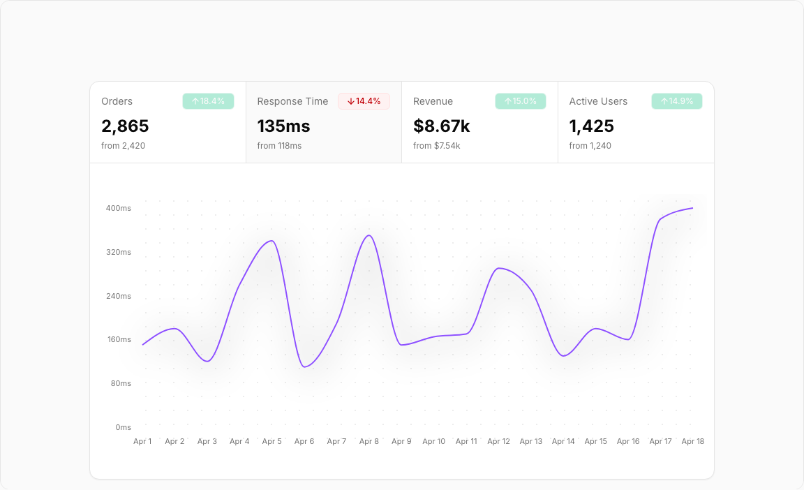
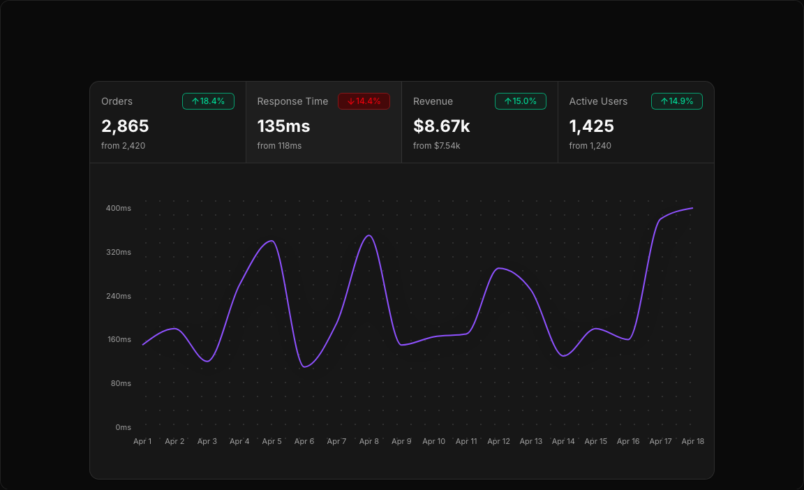
Line Chart 6 – Platform Metrics Switcher
An elegant interactive dashboard that lets users switch between multiple KPIs. Each metric has its own color and formatting, perfect for monitoring e-commerce platform health.
Key Features
- Four Switchable Metrics – Orders, Response Time, Revenue, Active Users.
- Click to Switch – Select any metric card to update the chart.
- Trend Indicators – Up/down arrows with percentage changes.
- Metric-Specific Formatting – Custom display for each data type.
- Color-Coded Selection – Active metric highlighted with its theme color.
Visual Design
- Color Scheme – Teal (orders), Violet (response), Lime (revenue), Sky (users).
- Card Highlight – Bottom border indicates selected metric.
- Clean Chart – Focused single-line display for clarity.
Use Cases
- Platform Monitoring – Real-time KPI tracking dashboards.
- Operations Analytics – Monitor multiple metrics in one view.
- Executive Dashboards – Quick metric switching for reports.
- SaaS Metrics – Track diverse product KPIs together.
Technical Stack
- Recharts – LineChart with dynamic dataKey switching.
- Tailwind CSS – Four distinct color themes.
- Radix UI – Card components with state management.
- Lucide Icons – ArrowUp, ArrowDown for trends.
Didn't find what you were looking for?
Suggest block